
A little bit of history.
In 2020, we launched our Azure Periodic Table and it has been one of our most important public assets to date. Customers have used the table to navigate through the core service offerings available in Azure, finding easy to understand and accessible content to help with their journey to the Microsoft Cloud. Adopting our “Shift to the Right” mindset by moving away from the classic Infrastructure as a Service (IaaS) services in favour of platform, advanced compute and AI has empowered many of our customers to modernise their service infrastructure, reduce operational cost and realise business agility and advanced data processing capability. The table serves as a navigation engine to slowly move to the right.
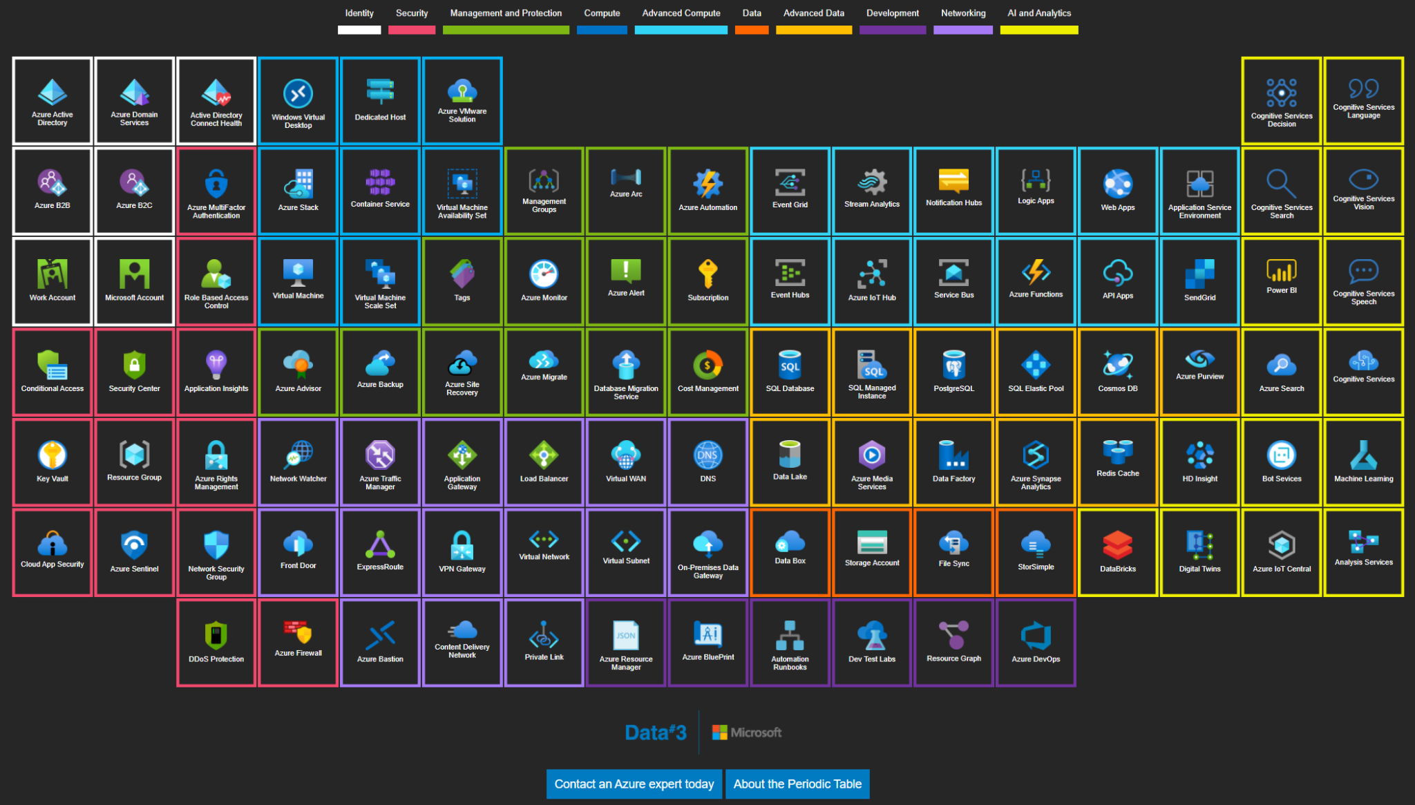
My original blog provides a bit more information and context for the first version of the Azure Periodic Table.
To say that this was a success is a dramatic understatement. We used the table many times during technical conversations with members of the Data#3 community as an interactive tool for service exploration and ideation whiteboard sessions. Shortly after launch, Microsoft reached out to us for approval to host a copy of the table at the Microsoft Technology Center in Sydney as a showcase for customers.
The table was also highly influential in our award for Microsoft’s Expert Managed Service Provider certification.
To date, the table has received 20k+ views.
One challenge we realised with the release of the table was the daily rate of change from Microsoft’s end. No other cloud provider has the development and release cadence for improved and new services in comparison. Relevance and content updates became challenging for us to keep up with. As of today, there are 397 distinct Azure Service items and that is a lot to keep track of!
The Azure Periodic Table was authored using a SharePoint list for the tile content. Tile column and row data dictated the element positioning, with a service category used to colour the element border and group highlighting. Content was added into a description free text field and URLs for further information added. This worked extremely well in that our consultants could easily create and collaborate on each Azure element. I built a PowerShell script that connected to the SharePoint list and exported out the content to a .JSON file for upload to the devtest version of the site for preview.
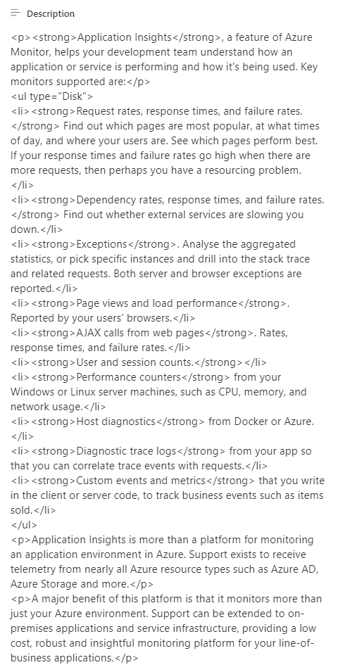
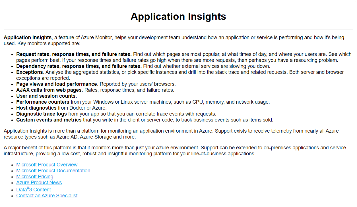
The thing that became time consuming and cumbersome with this approach was that any HTML formatting had to be done within the list content, so if you wanted to add a title header to the description then you had to use HTML tags. Suffice to say, this made content updating and creation a bit of a challenge, as the raw text stored in the description required HTML-coding.
Example List Content
Rendered Content
We decided a design refresh was due and worked with Luke Boerdam from EightFold Design to develop a new solution, using APIs to dynamically retrieve the SharePoint list items and preserve the rich text formatting of the descriptor text. We also took this opportunity to re-style the site for a slicker, more fluent style. Another great opportunity was to transform the structure of the site so that each element was hosted on its own URL. That way we can use Application Insights to track consumer and cohort interaction with each element, as well as directly link off to each element within our designs and proposals for further reference.
New SharePoint List Example:
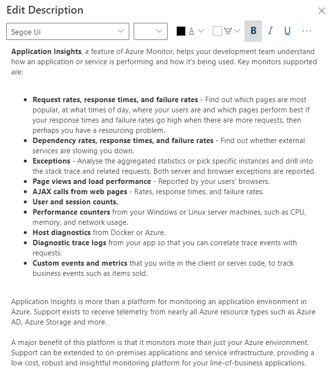
Rendered Version:
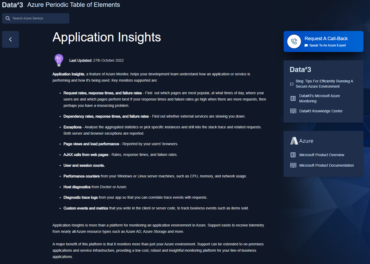
By preserving SharePoint’s rich text feature of a list item, we removed the requirement to manually add HTML styling for each element.
Now with a better method for content authoring we looked at the site as a whole. What was relevant? Obsolete? New? Or Noteworthy? I went back to the drawing board with Visio and re-designed the core layout for each element. Refreshing content and tuning the positional relevance for services.
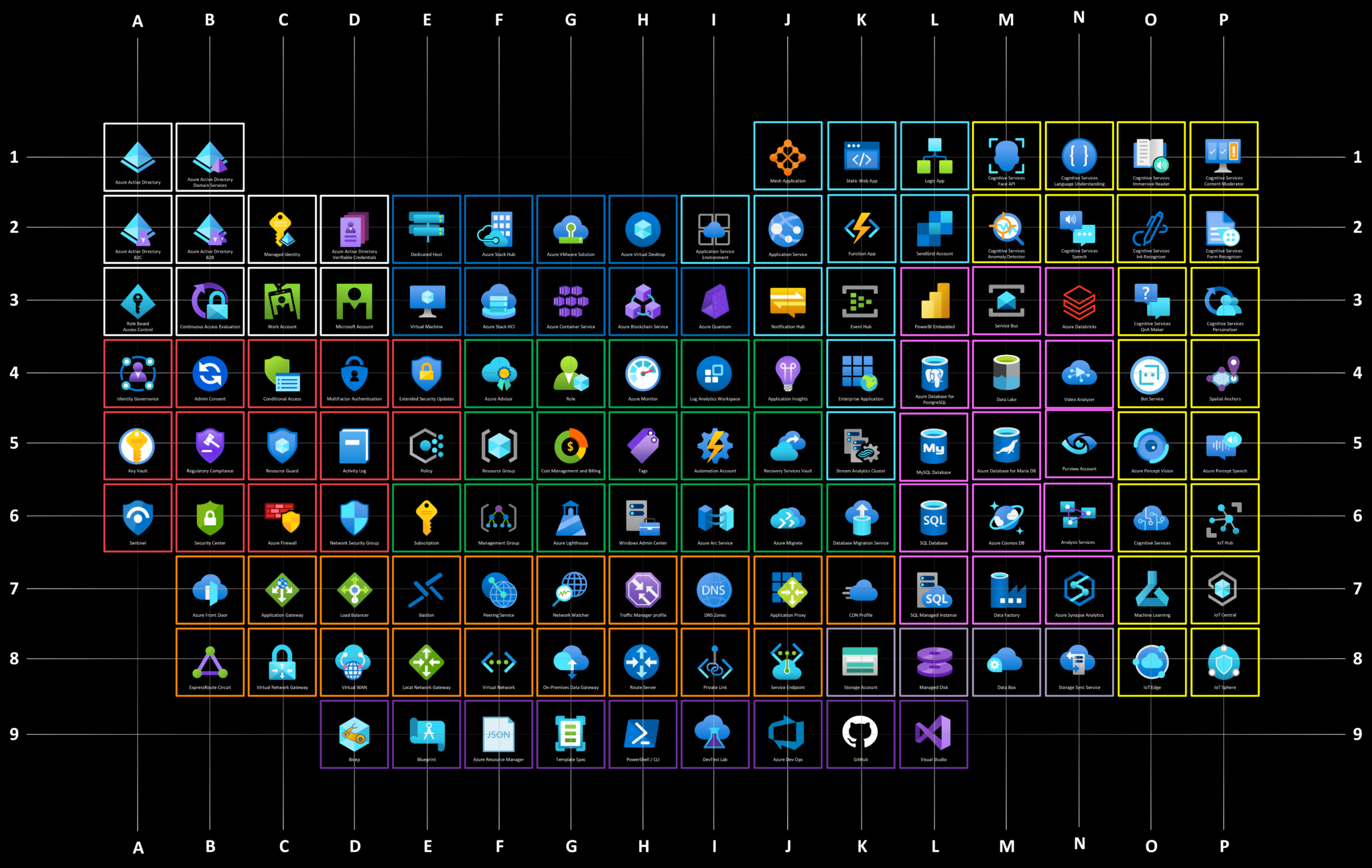
We then built a new front-end for the site and added several new features to improve site useability:
Of course! Here is what the new and improved version of the Azure Periodic Table, and some of its key features, look like:
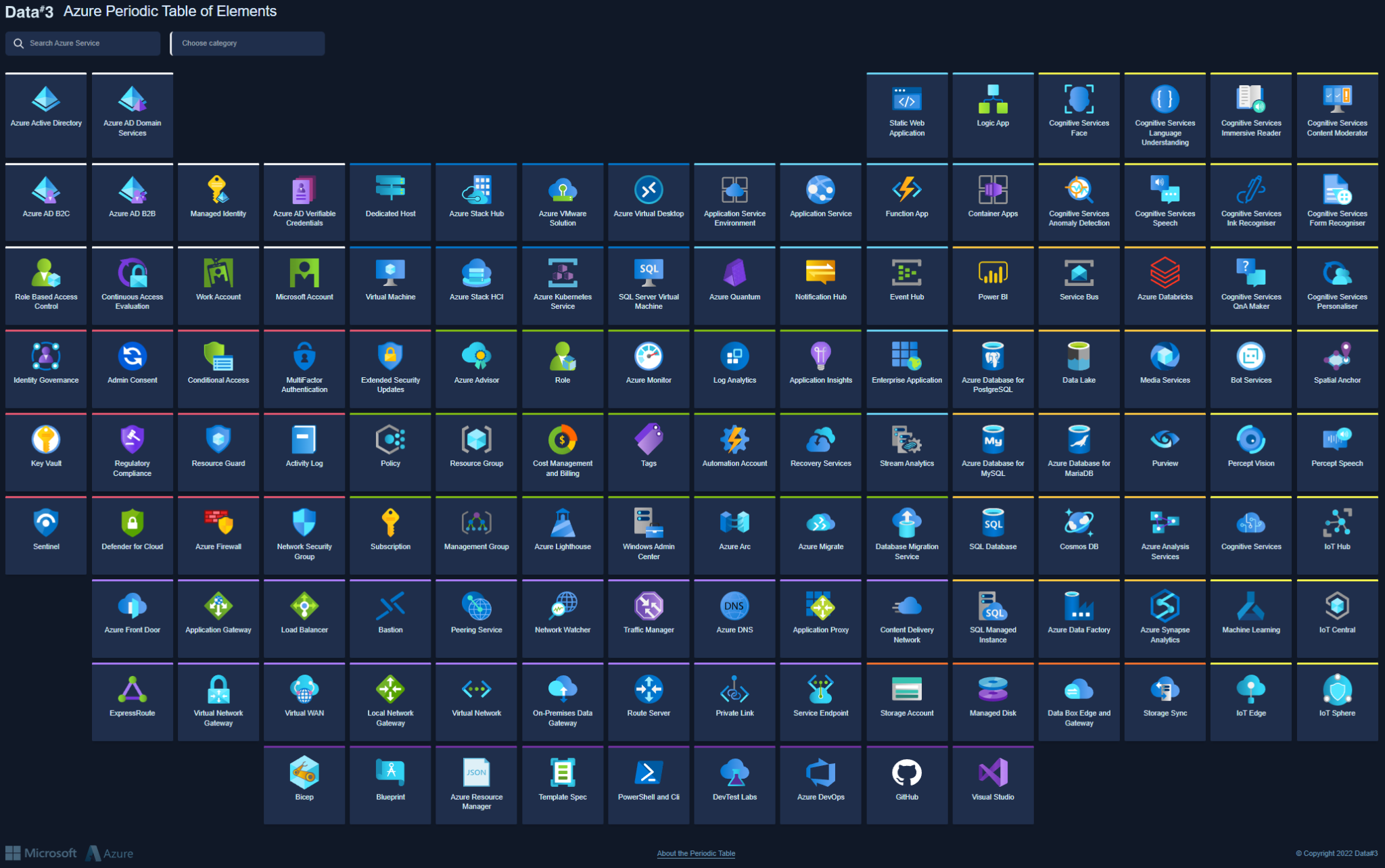
Category selection now selects the relevant elements:
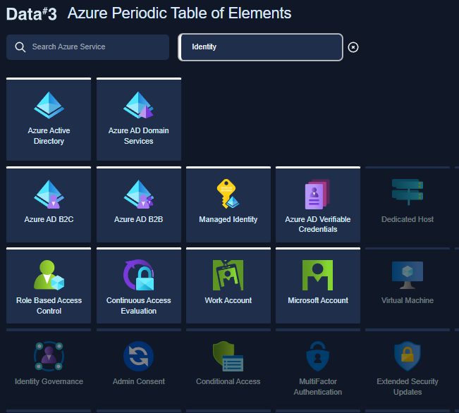
Type ahead also now takes you directly to the relevant elements:
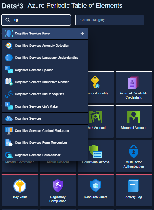
We’ve also added updated Microsoft reference links, and more of them, as well as created easy access to all of the content developed by Data#3 relating to each Azure element.
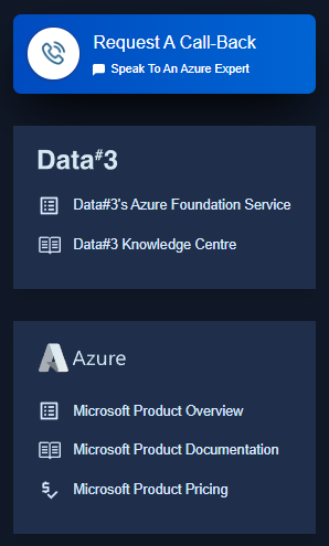
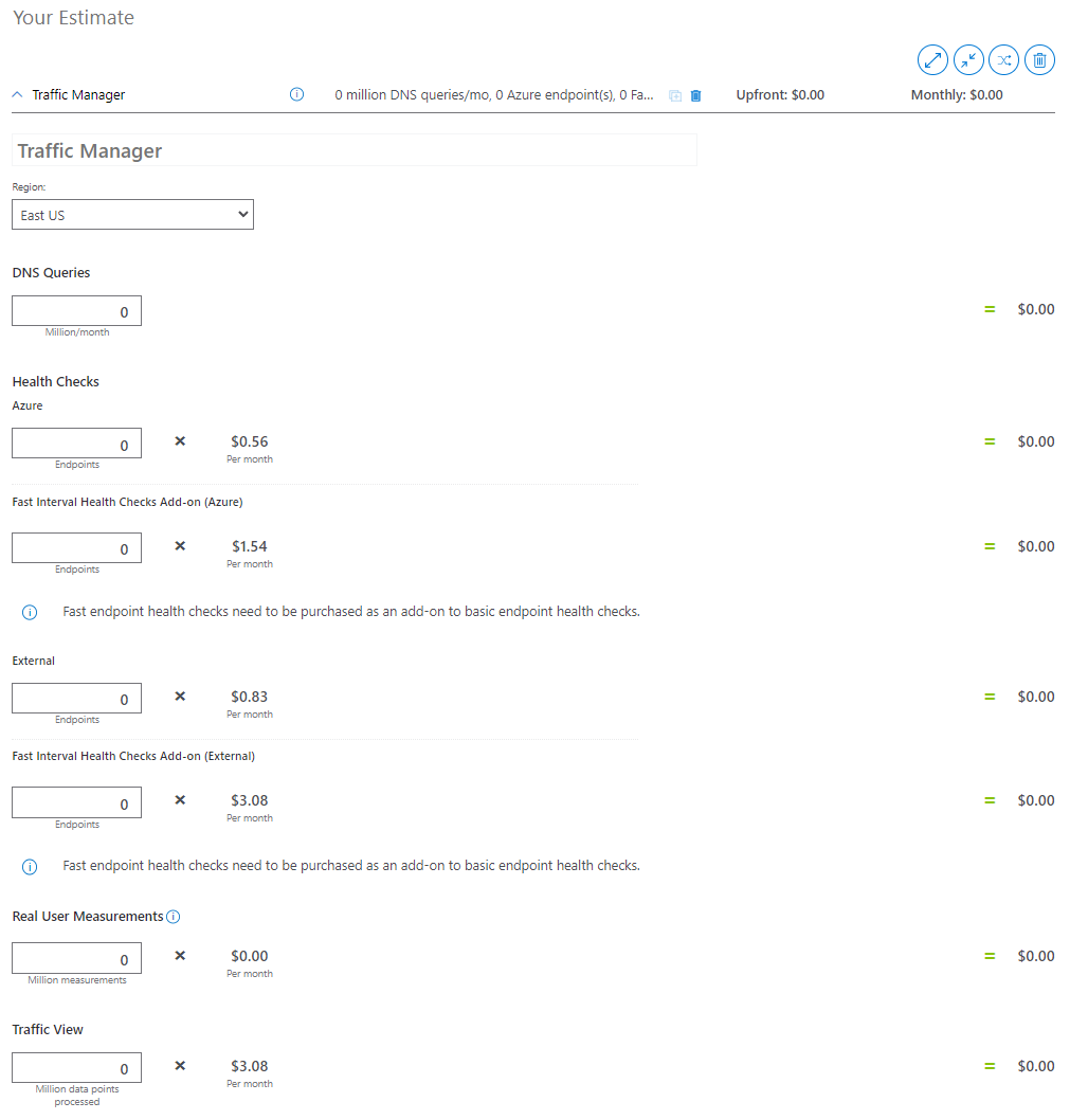
In the new version of the Azure Periodic Table, standard links take you to a more contextual destination. For example, selecting the Microsoft Product Pricing link for Traffic Manager takes you to the cost calculator filtered to the service.
Well, that’s the easy part! You can find the new, improved version of the Azure Periodic Table here.
If you’re looking for more information on the functions of Microsoft Azure within the context of your own business or organisation, fill out the form below and a member of Data#3’s expert Azure team will be in touch to discuss how we can help.
Information provided within this form will be handled in accordance with our privacy statement.